Invoice Design: How to Make an Invoice Look Professional
By Farasat Abbas Naqvi · Published August 6, 2026
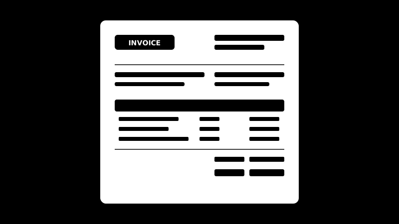
Invoice design is the part nobody teaches you. The fields are easy to look up — number, dates, line items, total. What decides whether the document reads as established or improvised is how those fields are arranged. This is about the arrangement. If you want the field-by-field process instead, the step-by-step guide to creating an invoice covers that.
Design matters here for a practical reason, not a vain one. An invoice is read by someone who did not ask for it, usually in a hurry, often on a phone, and frequently by a person in accounts who never met you. The faster they can find what they need, the sooner it enters the payment run.
The five-second test
Open your last invoice and look at it for five seconds, the way a payables clerk would. Three things should be unmistakable in that time: who it is from, how much is owed, and when it is due. If any of the three takes hunting, the design is working against you. Everything below is in service of that test.
Build a hierarchy, not a list
The commonest mistake is treating every element as equally important, so the invoice becomes a flat wall of similar-sized text. Give it three tiers:
- Primary — the amount due and the due date. These should be the largest non-heading text on the page, ideally set apart in their own block.
- Secondary — your business name, the invoice number, the client, the line items.
- Tertiary — payment instructions, terms, notes, tax registration numbers. Necessary, rarely the reason someone opened the file.
A useful discipline: if you squint until the text blurs, the total should still be the thing you notice.
Give money its own column
Amounts belong right-aligned in a dedicated column, never inline in a sentence. Right alignment lines up the decimal points, which lets the eye add the column without effort.
One detail worth the trouble: use tabular figures (sometimes called lining or monospaced numerals) for anything in a money column. Most typefaces default to proportional figures, where a 1 is narrower than an 8, so columns of numbers sit slightly ragged. Tabular figures give every digit the same width, and the column locks into a grid. It is the difference between a document that looks typeset and one that looks typed.
One typeface, three sizes
Resist mixing fonts. A single well-made sans-serif at three sizes — heading, body, caption — will out-perform two or three faces fighting each other. Keep body text at 10–11pt for print; smaller reads as fine print, which is not the association you want on a document asking for money.
Line length matters as much as size. Notes and terms running the full width of an A4 page are hard to read; cap them at roughly 70–80 characters and they become skimmable.
One accent colour, used sparingly
Colour on an invoice should do a job, not decorate. Pick one accent — usually from your logo — and spend it in two or three places: a rule under the header, the column headings, and the total. Everything else stays black or grey on white.
Two practical constraints. Invoices get printed in black and white, so never rely on colour alone to carry meaning. And heavy background fills eat ink and look cheap when they band on a home printer.
Whitespace is not wasted space
Cramped invoices feel like they are hiding something. Give the header room to breathe, keep a consistent margin on all four sides, and put clear space above the totals block so it separates from the line items. If the invoice runs slightly onto a second page, cut content before you cut margins — shrinking the margins to force one page is the most obvious tell of an amateur layout.
The logo: smaller than you think
Top-left is conventional, and conventions are useful on documents people process in bulk. Keep it modest — roughly the height of two or three lines of text. An oversized logo pushes the invoice number and dates down the page and signals brochure rather than business document. If your logo is a wordmark and your business name appears next to it, drop the duplicate text.
What to remove
Most invoices improve by subtraction. Common candidates: decorative borders and drop shadows, "Thank you for your business" set larger than the total, a second copy of your address in the footer, marketing straplines, and stock imagery. Every element that is not helping the five-second test is competing with it.
Test it the way your client sees it
Three checks before you settle on a layout:
- Print it in black and white. If the hierarchy survives without colour, the design is sound.
- Open the PDF on a phone. A large share of invoices are first seen on a small screen. Does the total still land?
- Show it to someone who has never seen your invoice. Ask what is owed and by when. If they hesitate, the layout, not the reader, is the problem.
A shortcut, if you would rather not start from scratch
These rules are already built into the templates here — hierarchy, tabular figures in the amount column, a single accent, and margins that hold up in print. Open the free invoice generator to fill one in and export a PDF, or take a Word invoice template and adapt the layout to your own brand. Either way, run the five-second test on the result before you send it.